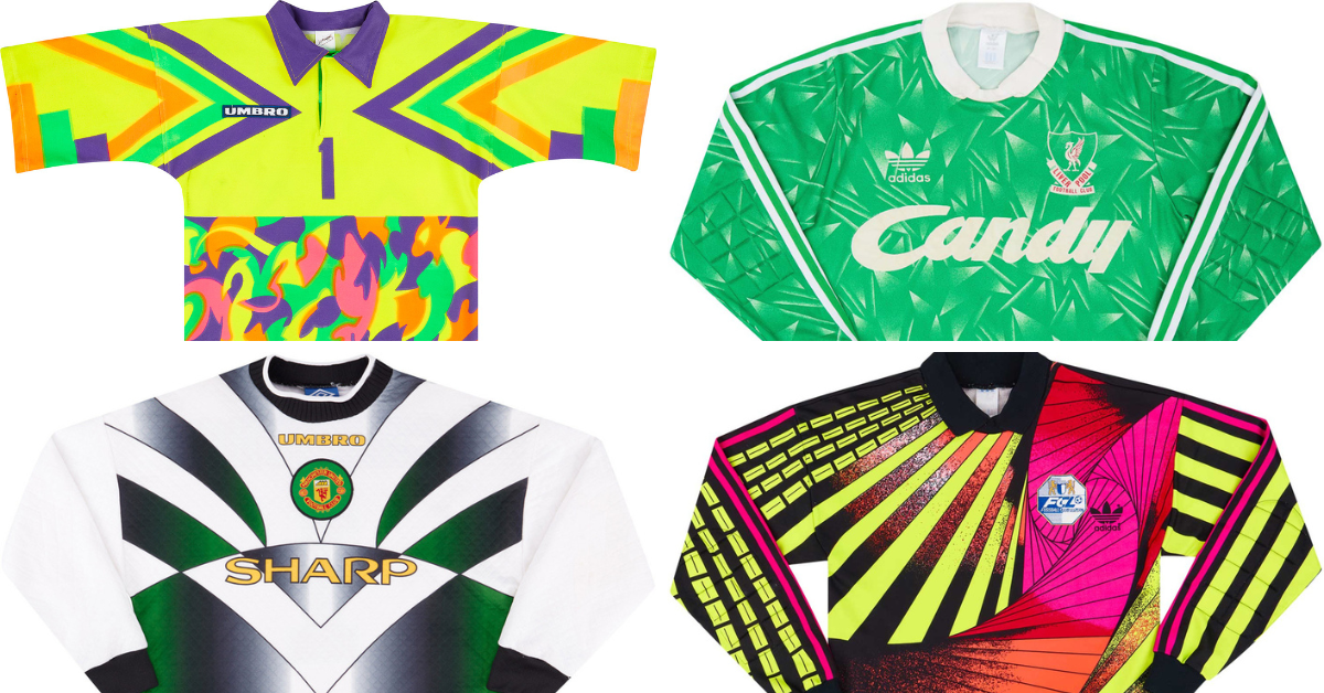
Design inspiration can come from a variety of places. But, within the past couple of years, there has been a trend of designs becoming more generic and somewhat boring. Which in turn loses identity and uniqueness. For example, many luxury fashion brands have changed their once distinctive logos to a generic sans-serif font. This has made the logos in this space now virtually indistinguishable.
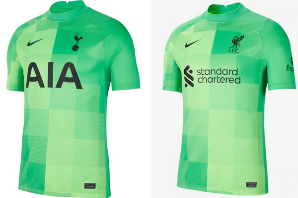
The generic elements can also be found within the design of football kits with the use of template shirts. This is particularly apparent within goalkeeper kits. In the past goalkeeper’s shirts were notorious for pushing the boundaries in terms of design. But now they can be seen as generic and repetitive. This lack of design originality can be seen as last season’s Liverpool and Tottenham Hotspurs goalkeeper kits are identical in terms of design.
In light of this, we have put our heads together to pull out some of our favourite goalkeeper kits from over the years which break from the norm. Hopefully these bold colourways and wacky designs can prove as inspiration as to why its important to be original.
1996 England Goalkeeper Shirt
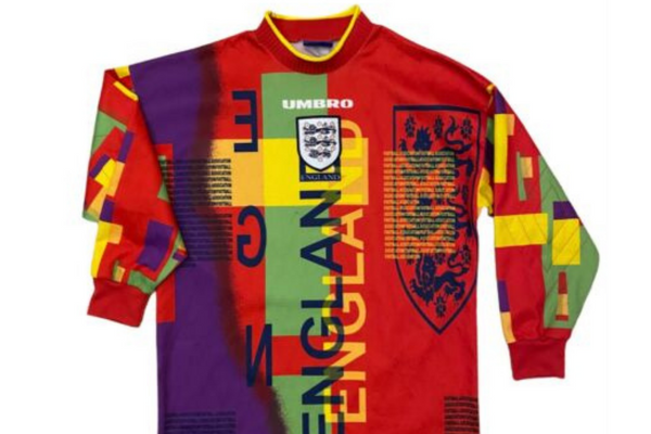
We couldn’t compile a list of goalkeeper kit designs which break the norm without this notorious England kit from 1996. In an era of wacky designs this certainly stands out from the rest. This design had been universally slammed by fans at the time of release. Luckily for them this kit was only ever worn once.
1994 Mexico Goalkeeper Shirt
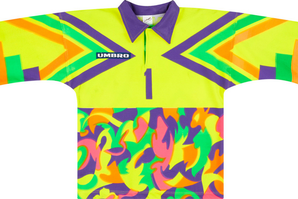
This shirt is definitely one of the most striking kits to be worn at any World Cup. The shirt featuring bold chevrons and a multicoloured camouflage-esque lower half was by Mexico’s number 1 at the time, Jorge Campos. This kit was donned at the 1994 World Cup and gained universal admiration by fans for the flashy design.
1996/97 Argentina Goalkeeper Shirt
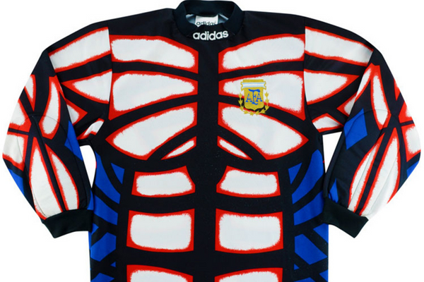
This Argentina goalkeeper shirt certainly takes muscle fit to a new level. Within the design of modern kits, it’s commonplace to see innovative shirts which place a priority on performance. The majority of shirts are streamlined with breathable elements. But, this goalkeeper shirt is most definitely a throwback to when this wasn’t the case.
2019/20 AFC Bendale Goalkeeper Shirt
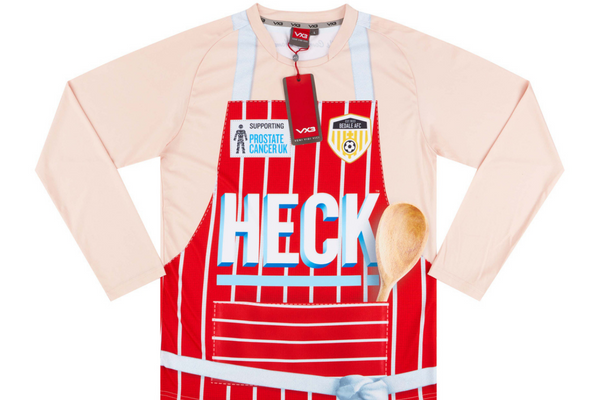
Any design can be arguably ruined by an intrusive sponsor but with this design, the sponsor certainly makes this kit unique. This kit was worn by 11th division side AFC Bendale and features the phrase ‘Football’s Coming Home For Tea’ on the reverse of the shirt. The purpose of this kit was to be shocking and to gain as much publicity as possible in order to raise awareness for Prostate Cancer UK.
1996/97 Liverpool Goalkeeper Shirt
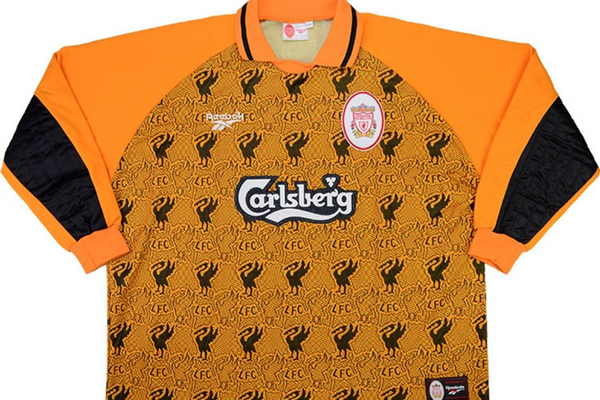
Liverpool had a number of bold and interesting goalkeeper shirts within the 1990’s and the 1996/97 season’s shirt definitely follows suit. The design is certainly unique to both the football club and the surrounding area. The liver bird is the symbol of the city of Liverpool and is prominently intertwined within this design. This goalkeeper shirt is a sure nod to the culture of the city.
Though these kits may not serve as a basis for your next clothing design, they all serve as examples as to how originality is an important design element. In a world where design is becoming more and similar, originality is often overlooked.

