Whether you’re looking to create custom branded clothing for a business uniform, a new clothing line, or a sports team, you’re going to need to choose a colour scheme.
But where do you even begin?
You know colour theory is a thing, and you may even be aware of the colour wheel, but there’s so much information out there and all you really need is a beginner’s explanation of the key concepts.
Well, you’ve come to the right place! Because we’re here to give you our simplest walk-through of the 7 main colour schemes that designers and creatives use.
This article will help inform your choices by breaking down the basics of creating a colour palette for your clothing and therefore generating the most eye-catching merch.
We will cover:
- The colour wheel
- The colour schemes
So, let’s get into it!
The Colour Wheel
First, it’s important to understand the colour wheel, which is the basis of each colour scheme that we will be examining.
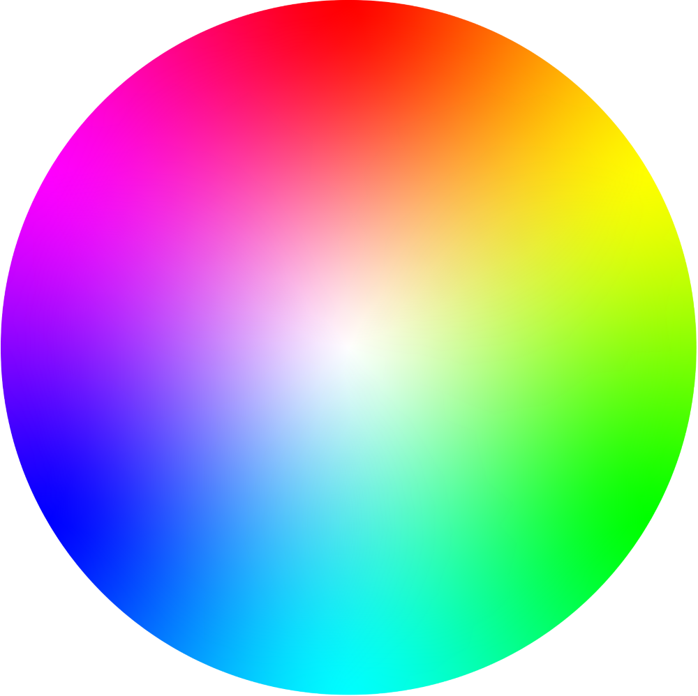
This circle of hues is an abstract illustration that demonstrates the relationships between every possible colour. Its presentation can vary from this gradient style to more segmented and defined variations, however the principle remains the same. It operates as the foundation of every colour scheme, and will hence be your guide as you develop your own.
Now that you know what we’ll be plotting each colour scheme against, let’s get into the schemes themselves.
Starting with…
1. Monochromatic
Monochromatic colour schemes employ just one hue at various levels of saturation (vibrance) and luminance (brightness). For example, multiple shades of the colour blue.
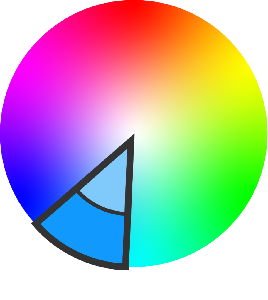
These schemes are ideal for a minimalist look because of their subtly dynamic nature; the range of similar tones is notable yet remains easy on the eyes.
The following is an example of some custom embroidery we did for one of our clients, who opted for a navy garment to match their monochrome blue logo.
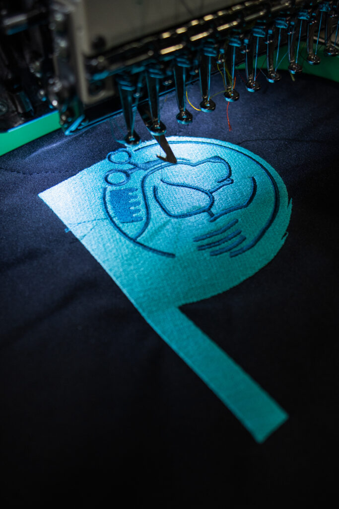
As demonstrated above, the rule you should typically follow when creating your logo or ordering personalising garments is to pick shades that are distinguishable enough from one another. This is to avoid a colour clash between your logo and the garment it’s printed or embroidered on. The more variety you create between their respective shades, the more visible your design will be.
But when it comes to branded workwear, we do tend to advise that a higher contrast between your team logo and garment colour is preferable. You might, therefore, wish to incorporate one of the following schemes in your uniform, instead.
2. Complementary
Here’s one you’ve most likely already heard of: the complementary colour scheme. This is when you pair two colours that sit directly across from one another on the wheel.
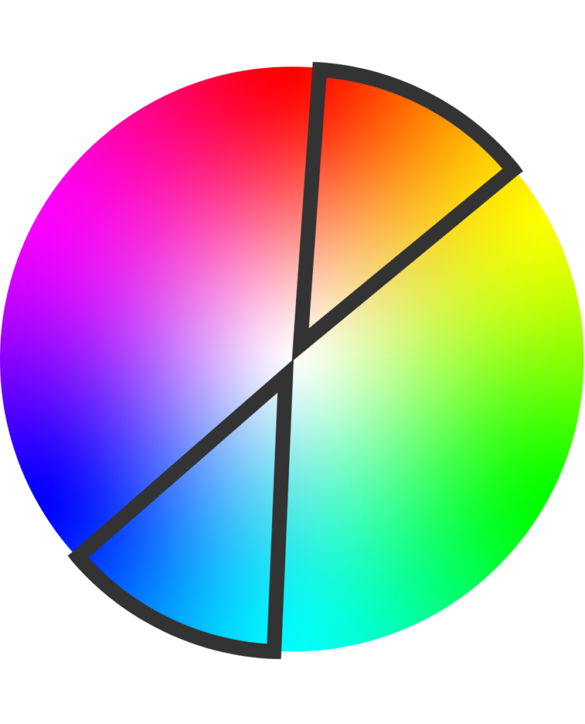
Complementary schemes are great for creating an uncomplicated sense of balance; they satisfy something subconscious within the onlooker without making a fuss.
This is an example of one such classic pairing, from an order placed by one of our customers. It features the directly opposing hues of royal blue and butter yellow (with some white accents).
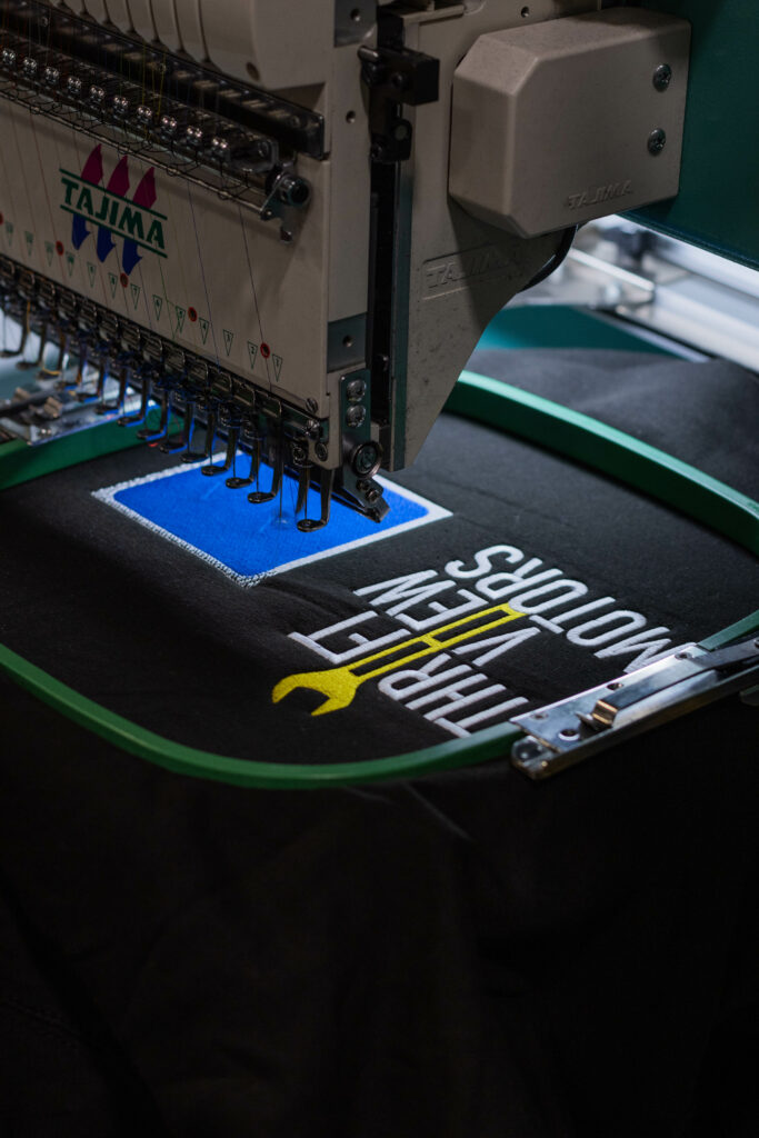
But, with how well-known these combinations are, they can also be a little predictable.
3. Split complementary
If you want to jazz up your complementary scheme just a smidge, you can easily switch to its split complementary counterpart. The only change you have to make is using the two hues either side of your main colour’s complement, instead.
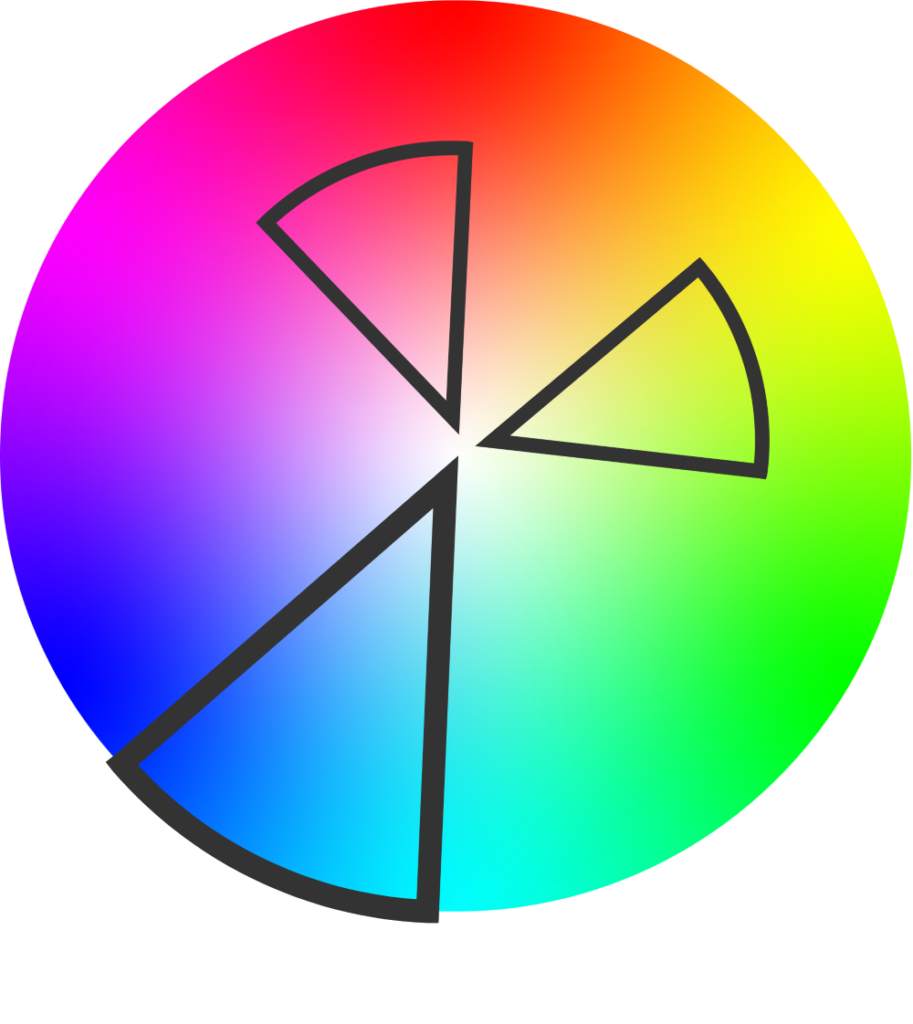
The joy of this kind of palette stems from its slightly surprising nature. Each secondary hue is a logical counterpart to the primary one, without being the most obvious, immediate choice.
Below is an example of an order we produced, for which the client chose turquoise, amber, and salmon as the main colours in their scheme.
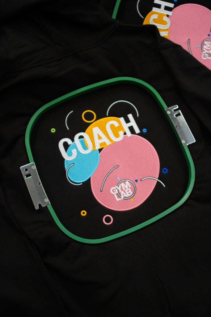
There are, notably, some minor deviances of hue in the smaller circles. However, looking at the colour wheel, these shades of chartreuse and royal blue still sit quite close to the main three hues.
The defining characteristic of a split complementary scheme is variety, after all.
4. Analogous
But, if you prefer a more uniform look, you can also use the hues either side of your main colour. This is known as an analogous scheme.
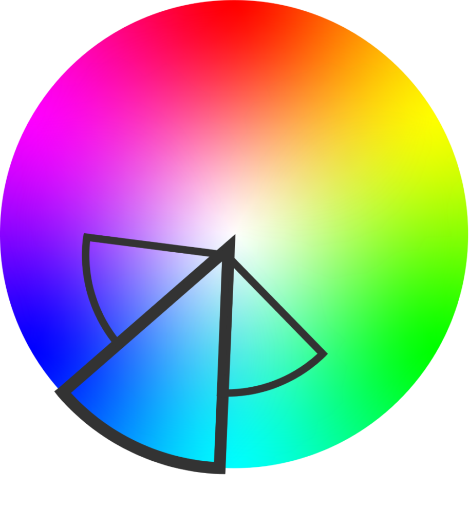
This is an effective way to create harmony via similar colours with just a bit more excitement than a monochrome scheme. Every tone is close enough to the main hue, without being directly related.
This is an order we printed in our DTG department. Despite yellow being the most dominant colour, this scheme appears to centre around green—what with the blue and yellow shades sitting either side of it on the wheel.

In painting, green is the product of mixing blue and yellow; the close relationship of these three hues therefore makes for a particularly harmonious trio.
But there’s still one more way to combine three areas of the colour wheel!
5. Triadic
If you’re after something higher-contrast, you might wish to try a triadic scheme. These essentially involve three equidistant colours (in their various shades) around the wheel. You could almost see it like three evenly-spaced monochrome schemes combined.
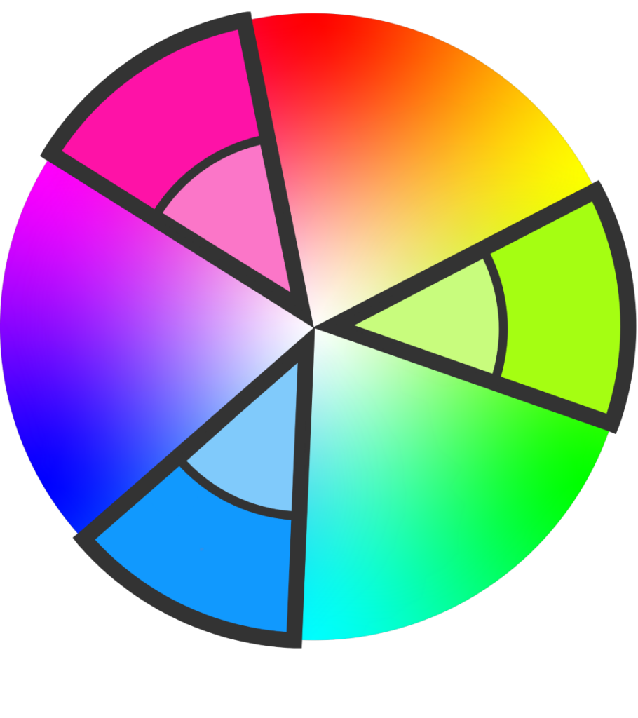
We, ourselves, use a triadic scheme for all our branding at Clothes2order.

With our primary colour being our unique shade of blue, we also often feature hot pink and green across our website, flyers, and more. Likewise, this palette can be seen on the uniforms our staff wear to work.
It creates a great sense of cohesion and oneness as a team, as well as being a bright and fun way to represent ourselves as a company.
6. Square
We’ve had schemes of one, two, and even three colours. So it seems only right that we add one more, giving us a square. As the name would suggest, square colour schemes rely on a selection of four evenly-spaced colours around the wheel.
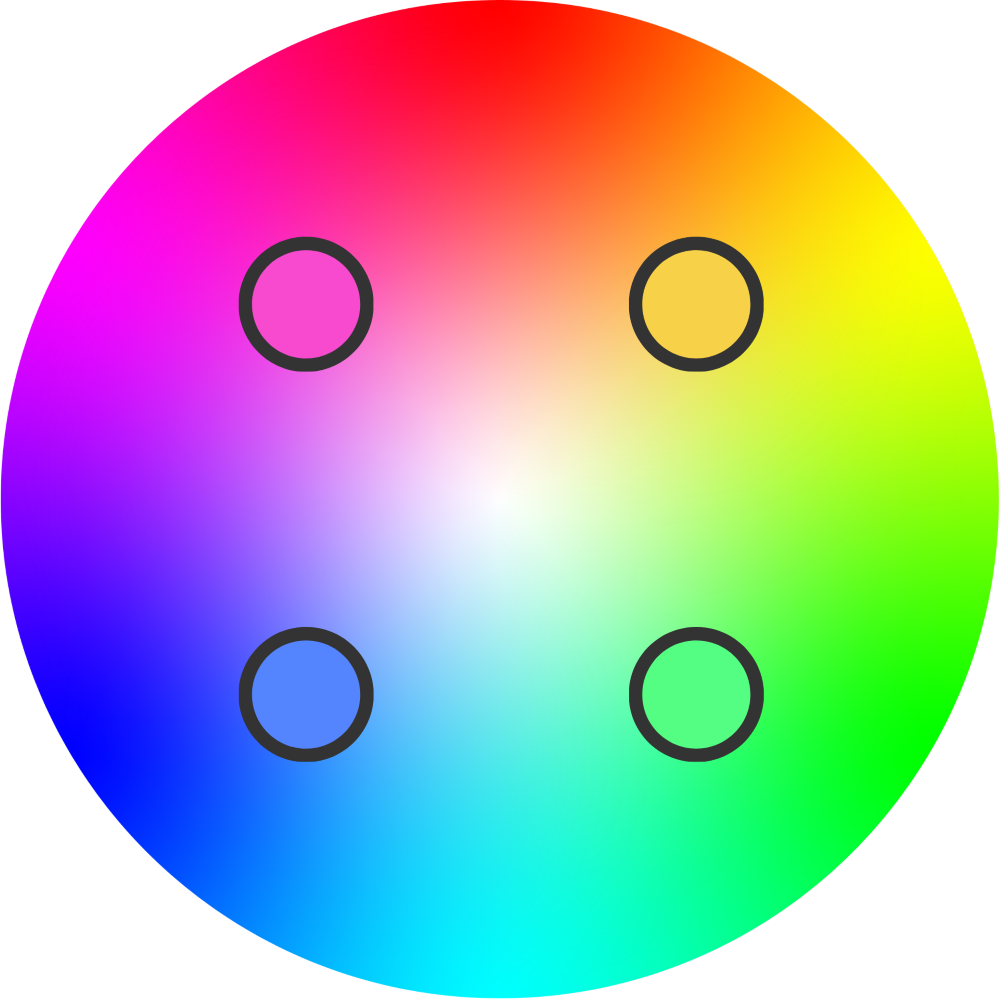
By plotting each colour at an equal distance from the next, you can ensure that your choices all share the same qualities (such as brightness or saturation).
These schemes are perfect for a diverse yet balanced effect. The multitude of colours allows for an exciting range, meanwhile the consistent proximity between each one provides a sense of coherence throughout.
7. Rectangle (Tetradic)
But if you pick out the four corners of a rectangle, instead, you end up with a tetrad; which is really just made up of two complementary pairs.
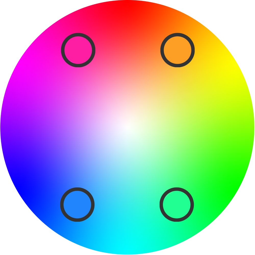
This is ideal for just a smidge more variance between the hues.
We tend not to see perfectly square or rectangular colour schemes going through our production as often, but some of our more colourful applications do appear to use each hue in a vaguely tetradic shape.
Below is a t-shirt we printed via DTG, that appears to use four main colours from different corners of the wheel (and a few secondary shades of each).
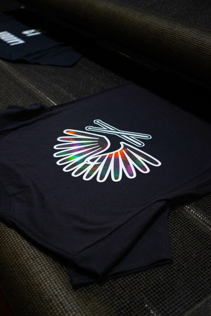
Although not a precisely tetradic example, it nevertheless demonstrates the impact of these more geometric multi-coloured schemes.
So, To Recap…
The 7 types of colour scheme are:
- Monochromatic
- Complementary
- Split complementary
- Analogous
- Triadic
- Square
- Rectangle (Tetradic)
Each one has its own merits as well as challenges, and it is up to you to establish which approach suits your needs best.
In addition to this breakdown, there are myriad handy tools online to help you establish the ideal palette, such as Canva’s color wheel or the Adobe color palette generator. These are particularly useful if you already have one (or two) colours in mind.
As for your first choice, you might want to stay on-trend and consider Pantone’s Colour of the Year, or perhaps opt for a more timeless hue.
Whatever your approach from here, we hope this guide has been a helpful first step into the world of colour theory.
And if you intend to apply this to your own custom clothing, feel free to peruse the rest of our blog for more tips and tricks pertaining to personalised gear, as well as business insights such as why is branding important and how to start a t shirt business.

