
Last month, the Living Wage Foundation unveiled a bold new look. More than just a design refresh, this rebrand reflects a modern, confident message — one that feels right for an organisation championing fairness in today’s workplace.
But what does this have to do with custom branded workwear and uniforms? A lot, actually. A logo is more than just a badge — it’s your values, visibility, and voice, stitched into everything from business cards to boiler suits.
Let’s break it down.
Before and After: The Living Wage Logo
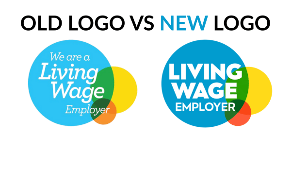
Old Logo:
The previous logo used soft, overlapping colour circles with a light, lowercase serif font. It had a friendly, grassroots vibe but wasn’t particularly strong in digital or small-scale print contexts — like embroidered badges on uniforms.
New Logo (2025):
The rebrand introduces a confident, geometric sans-serif font in all caps, improving readability and impact. The overlapping shapes remain but are refined with clearer colour contrast. The layout is more structured, making it ideal for scalable use across merchandise, digital platforms — and yes, workwear.
The new logo says: “We’re established. We’re proud. And we’re here to be seen.”
The Workwear Angle: Why Logos Matter on Uniforms
If your staff wear branded uniforms, your logo isn’t just a design element — it’s part of their identity and a constant visual cue for your customers. Think about how your logo looks on:
- Embroidered polos
- Printed hi-vis jackets
- Caps and aprons
- Name badges or lanyards
An outdated or overly complex logo can blur in print or thread, lose meaning at distance, or even feel out of step with your values.
What You Can Learn From This Rebrand
The Living Wage Foundation rebrand offers some powerful lessons for businesses considering a logo refresh — especially those ordering branded clothing:
🎯 1. Clarity is Confidence
The all-caps, clean typography of the new logo improves legibility. Logos on uniforms need to be immediately recognisable — especially at a distance or when in motion.
🧵 2. Simplify for Stitching
Complex gradients or fine lines don’t translate well in embroidery. The Living Wage’s new flat design is a great example of being print- and thread-friendly.
📱 3. Think Multi-Platform
From digital avatars to uniform badges, your logo needs to scale. The badge-style shape of the new design works well on both screens and sleeves.
🪪 4. Reflect Your Evolution
As your business grows or shifts, your logo should reflect your current identity. Has your offering changed? Your ethos? Don’t let your visuals lag behind.
Ready for a Rebrand? Ask Yourself:
Before printing your next set of uniforms, consider:
- Does your current logo look professional when embroidered or printed?
- Is it still aligned with who you are today?
- Can it be recognised at a glance?
If the answer to any of those is “not really,” it might be time to rethink your visual identity — just like the Living Wage Foundation did.
Final Thought
A rebrand isn’t just about aesthetics — it’s about alignment. When your logo, your values, and your presentation all line up, your brand becomes stronger, more trustworthy, and more memorable.
So the next time you’re ordering uniforms or branded gear, remember: your logo isn’t just a patch. It’s a promise.
Thinking about updating your logo or testing it on workwear?
We offer no minimum order, so you can order just one item — with your logo printed or embroidered — to see how it looks in real life before committing to a full run. It’s the perfect way to trial your rebrand on a garment or explore how your existing logo performs in different formats.
